Probability Distribution
- Details
- Last Updated: Wednesday, 21 June 2023 20:12
- Published: Friday, 06 November 2020 02:12
- Hits: 1890
Probability Distribution
We looked at pdf (probability distribution function) earlier. A probability distribution can either be univariate or multivariate
- Univariate: A univariate distribution gives the probabilities of a single random var taking on various alternative values;
- Multivariate: A multivariate distribution gives the probabilities of a random vector—a set of two or more random variables—taking on various combinations of values.
Normal Distribution:
There are many kinds of univariate/multivariate distribution function, but we'll mostly talk about "Normal Distribution" aka "Guassian distribution" (or bell shape distribution). Normal distribution is what you will encounter in almost all practical examples in semiconductors, AI, etc. So makes sense to study normal dist in detail. Yu can read about many other kind of dist in wikipedia link:
1. Univariate normal distribution:
https://en.wikipedia.org/wiki/Normal_distribution
pdf function is:
f(x) = 1/(σ√2π).exp(-1/2*((x-μ)/σ)2) => Here μ=mean, σ=std deviation (or σ2= variance). We divide it by σ, so that the integral of f(x) is 1.
Standard normal distribution is simplest normal dist with μ=0, σ=0.
The way we write that random var X belongs to normal distrbution is via this notation:
X ~ N(μ, σ2) => Here N means normal distribution. mean and variance are provided.
We often hear 1σ, 2σ, terms. These refer to σ in Normal dist. If we draw pdf for normal distribution and try to calculate as to how many samples lie within +/- 1σ, we see that 68% of the values are within 1σ or 1 std deviation. Similarly fo 2σ, it's 95%, while for 3σ, it's 99.7%. 3σ is often referred to as 1 out of 1000 outside the range. So that implies that 3σ is roughly taken as 99.9% even though it's 99.7% when solved.
As 3σ is taken as 1 out of 103 or 10-3, 4σ is taken as 10-4, 5σ as 10-5 and 6σ as 10-6 event. So, 6σ implies only 1 out of 1M chance of the sample ebing outside the range. 6σ is used very commonly in industries. Many products have requirement of 6σ defects, i.e 1 ppm defect (only 1 out of 1M parts is allowed to be defective). In semiconductors, 3σ defect rate is targeted for a lot of parameters.
2. Multivariate normal distribution: It's generalization of one dimenesional univariate normal dist to higher dimensions.
https://en.wikipedia.org/wiki/Multivariate_normal_distribution
A random vector X = X1,X2,...Xn is said to be multivariate normal dist if Every linear combination 
A Multivariate Normal dist is hard to visualize, and not that common. A more common case of multivariate normal dist is bivariate normal dist which is normal dist with dimension=2.
Bivariate normal distribution: Given 2 random vector X, Y, a bivariate pdf function is:
f(x,y) = 1/(2πσx σy √(1-ρ2)).exp(-1/(2(1-ρ2))*[ ((x-μx)/σx)2 - 2ρ(x-μx)/σx*(y-μy)/σy + ((y-μy)/σy)2 ] => Here μ=mean, σ=std deviation (or σ2= variance). We defined a new term rho (ρ), which is the Pearson correlation coefficient R b/w X and Y. It's the same Pearson coeff that we saw earlier in stats section. rho (ρ) captures the dependence of Y on X. If Y is independent of X, then ρ=0, while if Y is completely dependent on X, then ρ=1. We will see more examples of this later. We divide this expr by complex looking term, so that the 2D integral of f(x,y) is 1.
2D plot of f(x,y): We will use gnuplot to plot these.
This is the gnuplot pgm (look in gnuplot section for cmds and usage). f_bi is the final func for Bivariate normal dist func.
gnuplot> set pm3d
gnuplot> set contour both
gnuplot> set isosamples 100
gnuplot> set xrange[-1:1]
gnuplot> set yrange[-1:1]
gnuplot> f1(x,y,mux,muy,sigx,sigy,rho)=((x-mux)/sigx)**2 - 2*rho*((x-mux)/sigx)*((y-muy)/sigy) + ((y-muy)/sigy)**2
gnuplot> f_bi(x,y,mux,muy,sigx,sigy,rho)=1/(2*pi*sigx*sigy*(1-rho**2)**0.5)*exp((-1/(2*(1 - rho**2)))*f1(x,y,mux,muy,sigx,sigy,rho))
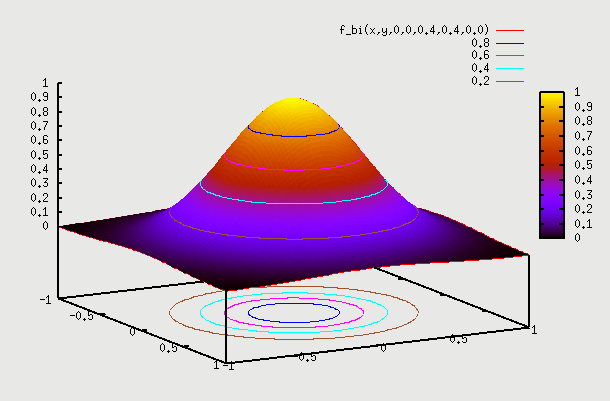
1. f(x,y) with ρ=0 => Let's say we have sample of people where X is their height and Y is their IQ. We don't expect to have any dependence between the two. So, here f(X) on X axis is the height of people which is a 1D normal distribution around some mean. Similarly f(Y) on Y axis is the IQ of people which is again a 1D normal distribution around some mean. If we plot a 2D pdf of this, then we are basically multiplying probability of X with probability of Y to get probability at point (x,y). Superimposing f(X) and f(Y) gives contour as a circle as X=mean+sigma or X=mean-sigma will yield the same value for Y as probability of Y doesn't change based on what the probability of X is. Infact this is the properrty and definition of independence => if f(x,y)=f(x).f(y) that means X and Y are independent. We can see that setting ρ=0 yields that. Below is the gnuplot function and the plot
gnuplot> splot f_bi(x,y,0,0,0.4,0.4,0.0)
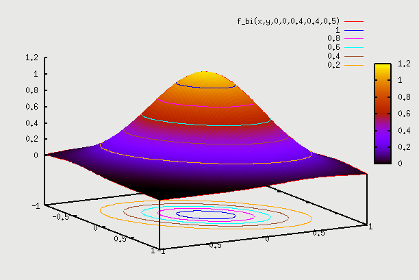
2. f(x,y) with ρ=0.5 =>Here we can consider the example of same people as above but plot weight Y vs Height X. We hope to see some correlation. What this means is that pdf(Y) varies depending on which point X is chosen. So, if we are at X=mean, then pdf(Y) is some shape, and if we choose X=mean + sigma, then pdf(Y) is some other shape (but both shapes are normal). So, pdf(Y) plotted independently on Y axis as f(Y) is for a particular X. We have to find pdf(Y) for each value of X, and then draw 2D plot for all such X. This data is going to come from field observation, and the 2D plot that we get will determine what the value of ρ is. Here the contour plot start becoming an ellipse instead of a circle. You can find proof on internet that this eqn indeed becomes an ellipse (circle is a special case of an ellipse, where major and minor axis are the same). There is one such proof here: https://www.michaelchughes.com/blog/2013/01/why-contours-for-multivariate-gaussian-are-elliptical/
In this case when we draw pdf(X) and pdf(Y) on 2 axis, it is the pdf assuming ρ=0 (same as in case 1 above). You can think of it as pdf of height X irrespective of what the weight Y is. Of course the pdf of height X is different for different weights Y, But we are kind of drawing the global pdf distribution, the same as we drew in case 1 above. Similarly we do it for pdf of weight Y. So, remember this distinction - pdf plots on X and Y axis in case 2 are still pdf plots from case 1 above. When we start plotting the 2D points, is when we know if it's an ellipse or a circle, which gives us the value of ρ.
gnuplot> splot f_bi(x,y,0,0,0.4,0.4,0.5)
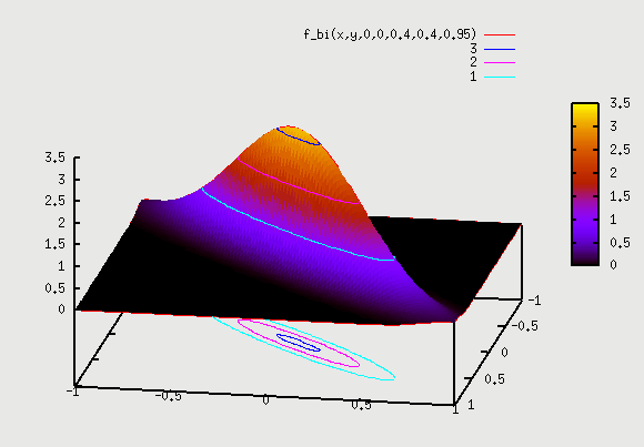
3. f(x,y) with ρ=0.95 =>Here correlation goes to extreme. We can consider the example of same people as above but Y axis as "score in Algebra2" and X axis as "score in Algebra1". We hope to see very strong correlation, as someone who scores well in Algebra1 will have high probability of scoring well in Algebra2. Similarly someone who scored bad in Algebra1 will have high probability of scoring bad in Algebra2 as well. The plot here starts becoming narrow ellipse and in the extreme case of ρ=1 becomes a 1D slanted copy of pdf of X. What that means is that Y doesn't even have a distribution given X. i.e if we are told that X=57 is the score, then Y is fixed to be Y=59 => Y doesn't have a distribution anymore given a particular X. In real life, Y will likely have a distribution for ex. from Y=54 to Y=60 (+3σ to -3σ range). This data is again going to come from field observation.
gnuplot> splot f_bi(x,y,0,0,0.4,0.4,0.95)
Let's see the example in detail once again for all values of ρ => If there are 5 kids with Algebra1 scores of (8,11,6,9,10) at -3σ, then if we go and look at Algebra2 score of these 5 kids, that will tell us the value of ρ. If scores in Algebra2 are all over the place from 0 to 100 (i.e 89, 9, 50, 75, 32) then we have no dependence and 2D contour plot looks like circle. However, if we see Algebra2 scores for these 5 kids are in narrow range as (7,10, 6,11,12), then this has a high dependence and the 2D contour plot looks like a narrow ellipse. This indicates a high value of ρ.
Also, we observe that as ρ goes from ρ=0 (plot 1) to ρ=1 (plot 3) the circle starts moving inwards, and squeezed into an ellipse. So points with some probablility for plot 1 (let's say 0.01 is combined pdf for point A on circle) have moved inwards for same probability for plot 2 and further in for plot 3. Also, the height of 3D plot goes up as the total pdf has to remain 1 for any curve. It's not too difficult to visualize this. Consider a (-3σ, -3σ) point for X and Y axis. This point has probability of 0.003*0.003 = 0.00001 for plot 1 where ρ=0 (i.e X and Y are independent). Now with ρ=1 (plot 3), the -3σ point for X axis has probability of 0.003, but -3σ point for Y axis has probability of 1 (since with full correlation, Y has 100% probability of being at -3σ when X is at -3σ). So, probability of (-3σ, -3σ) point is 0.003*1=0.003. So, this point now moves inward into the ellipse. The original point of 0.00001 probability is not (-3σ, -3σ) point anymore. It looks like (-4σ, -4σ) point now lies closer to that original point, since it's probability is 10^-4*1=0.0001. Even this is higher. Maybe be more like (-4.5σ, -4.5σ) point lies on that point. So, we see how the correlation factor moves the σ points inwards.
2D plot for different samples:
In all the above plots we considered a sample of people and plotted different attributes of same sample of people. However, if we are plotting attributes of different samples, then it gets tricky. For ex, let's say we plot height of women vs height of men. What does it mean? Given pdf of height of men and pdf of height of women, what does combined pdf mean? Does it mean => given men of height=5ft with prob=0.1, and women of height 4ft with prob=0.2, what is the combined probability of finding men of height=5ft AND women of height=4ft. Best we can say is that are independent and so combined prob=0.1*0.2=0.02. So, we expect to see plot which is going to be similar plot as 1 above (with ρ=0). But how do we get field data for this sample to draw a 2D plot. Do we choose a man, and then choose a woman? The combined 2D pdf doesn't make sense, as men and women are 2 different samples.
However, we know that in a population where people are shorter, both men and women tend to be shorter, and in a population where people are taller, both men and women tend to be taller. So, if we take a sample of people, where men's height varied from 6ft to 7ft, and plotted women's height from that community, we might see that their height varies from 5.5ft to 6.5ft. Similarly for population where men's height varied from 5ft to 6ft, and plotted women's height from that community, we might see that their height varies from 4.5ft to 5.5ft. These are local variation within a subset, instead of global variation. If we take all of these local plots, and combine hem into a global plot, then we can get the dependence data. They suggest some correlation. If we plot all of these on our 2D plot, we may see that ρ≠0. We will see ellipse instead of a circle for iso contours of these 2D plot. These kind of plots are very common in semiconductors that we will see later.
Properties: A lot of cool properties of normal distribution appear, if we take the random variables to be independent, i.e ρ=0. Let's look at some of these properties:
Sum of independent Normal RV: Below is true ONLY for independent RV. If RV have ρ≠0, then below property is not true any more.
If X1, X2, ...Xn are independent normal random variables, with means 


and variance σ12 + σ22 + ... + σn2.
A proof exists here: https://online.stat.psu.edu/stat414/lesson/26/26.1