US stock market indices
- Details
- Last Updated: Thursday, 19 March 2026 05:36
- Published: Saturday, 03 October 2020 20:45
- Hits: 2782
US Market index:
In the previous, we looked at stock market indices of major countries. Here, we'll look at USA stock market index in detail. There are many US market index. You will see their symbols on the finance websites. However, you can't buy these index directly. You will have to buy a fund that tracks this index. We'll talk about this later. Note that the companies that are part of any index are not set in stone. There is continuous reshuffling of companies that take place in an index to keep it relevant. Many companies get dropped out of the index, because they don't meet the requirements anymore, or they are just not generating enough profits or are not big enough to justify being in the index. I'm listing some of the popular indices below.
1. Wilshire index (W5000): The simplest stock market index in USA is the wilshire index. It simply adds up the market cap of all the companies in USA. So, it covers 100% of the market cap of all US listed companies. It's symbol is W5000. It's current quote can be found here:
https://www.marketwatch.com/investing/index/w5000/charts?countryCode=XX
When the W5000 is at 10,000, it means that the total market cap of all the companies in USA is $10,000B, i.e $10T. So, in this index, any company is weighted based on it's market cap.
W5000 was 33,000 at end of 2019, implying the total market cap of all US public companies was about $33T (there are many criteria for which companies are included in W5000 and which are not, but we'll bypass the details).
As of 2021 year end, it had a market cap of just about $50T (All time intraday high of $49T on Nov 22, 2021). So, in 2 years of pandemic, the total US stock market went up by 50% from a level which was already an all time high !! At end of 2024, market cap went to $60T (20% return in next 3 yrs).
Next 3 index are 3 headline index that are quoted in news all over the world.
2. S&P500 index (SPX): This is a subset of W5000 and includes only 500 US companies from different sectors. These are usually the largest companies in that sector. For US market, S&P500 is a well known index comprising about 80% of the total market. It's the most popular index, and for all practical purposes represents the whole US stock market. In fact, you won't see much difference b/w the returns generated by W5000 vs S&P500 over any long term duration.
This is the link for S&P500 Dow Jones Index: https://www.spglobal.com
As of June 30, 2020, total market cap of S&p500 index was $27T, while total market cap of whole US market based on Wilshire 5000 was $32T. So, S&P500 was about 85% of total market cap. So, returns of S&P500 would come in very close to that of the whole market, so it's wise to stick to S&P500 as an index for investing purpose. Historically S&P500 has given higher returns than Wilshire5000.
3. Dow Jones Industrial Average (DJIA): This is a very small subset of W5000, and comprises of only 30 largest companies. It's prestigious for a company to be part of this index. However, due to it's over reliance on only 30 companies, sometimes it doesn't line up with S&P500 in terms of yearly returns. However, DJIA usually has higher dividend yield,, as most of the companies in this index pay good dividend. However, it;s NOT market cap weighted but stock price weighted, so smaller companies can have bigger impact than larger companies. So, not as reliable as S&P500 index and not a good indicator of US market anymore.
4. Nasdaq Composite index (COMP, IXIC): This is one of the hottest index that is primarily tracking companies listed on Nasdaq stock exchange. This index is also commonly called as "Nasdaq", though Nasdaq is the name of the stock exchange and NOT of the index. website is https://www.nasdaq.com
There are about 2500 (or 4000??) stocks listed on Nasdaq, but only 2000 or so stocks are part of this index. Nasdaq is always associated with Tech stocks, though only 50% of the stocks listed on Nasdaq are tech stocks. Rest are stocks from other sectors as seen in S&P500. However, because of overweight of tech stocks in this index, it is a good barometer of tech stocks. In fact, top 10 stocks in this index account for more than 1/3 of the index performance.
Nasdaq-100 index (NDX): This is a further subset of Nasdaq composite index stocks. It contains top 100 tech stocks in Nasdaq. It accounts for more than 90% of the weight of Nasdaq composite index. That is why Nasdaq-100 is more widely used than Nasdaq composite index. It is heavily allocated towards top performing industries such as Technology (57%), Consumer Services (22%), and Health Care (7%). This is the most popular stock index along with S&P500. This index has consistently beaten S&P500 since it's inception. If you believe stock market will keep on making new highs, then a basket of risky hot stocks will always beat safe stable stocks. Nasdaq-100 proves that.
These are the 100 stocks in Nasdaq-100: https://www.slickcharts.com/nasdaq100
As you can see, just top 12 stocks account for 60% of the index weight. So, bottom half of the stocks aren't even relevant, since they account for less than 10% of the index weight. But to diversify and reduce risk, they have included these smaller companies, since in tech especially, a very small company can become a very big company in a matter of weeks, so you don't want to miss out on those gains. Nasdaq-100 is the index to stick to instead of Nasdaq composite. when people say they are buying nasdaq, they usually refer to Nasdaq-100.
5. Miscellaneous indices: There are many hundreds of indices available in USA and worldwide which have various misc stocks in them. Russell2000, Rusell3000, etc are many more indices which track small companies, growth companies, stable companies, etc. These indices have lagged behind S&P500, so not worth exploring.
Comparison of stock index:
Below is the chart showing returns of the 3 stock index from 1980 to 2020. As you can see, all indices track each other. The indices which rise faster during bull markets tend to fall faster during bear markets. However, one thing that is startling to notice is that the ratio of Nasdaq Composite to S&P500 never fell to below 1 except for very brief time in 2003 when Nasdaq had crashed 80% from the peak (i,e if you invested money in Nasdaq in 1980, at no point until 2020 did you end up with less money than if you had invested the same amount in S&P500). You read all these articles about how nasdaq is more risky than S&P500 (since nasdaq is overly concentrated in tech stocks, which is not entirely true), so we should invest in more diversified S&P500 index. But the charts show otherwise. Whether bull or bear market, nasdaq returns never fell below S&P500 returns over any 20 year period. Since markets always makes new highs, nasdaq will almost certainly keep beating S&P500 with lower risk than S&P500. This is the truth of markets that always keep making new highs. AndI'll repeat it again - as long as FED's ponzi scheme supports stock market, Nasdaq is the smarter way to go.
PERFORMANCE CHART OF 3 MAJOR INDICES
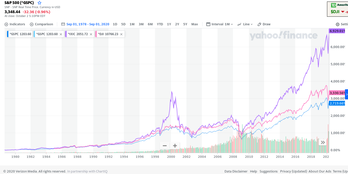
As seen from the chart above, Nasdaq index returned 2X the return of S&P500 index or the DJIA index. And that too with a lower risk, since Nasdaq never went below the other 2 indices. In a nutshell, if you believe that markets will always make new highs, you should always invest in Nasdaq composite index rather than S&P500. Dow Jones index is just way too concentrated in few stocks to really consider it (although here DJIA generated better returns than S&P500). However, the best time to invest in Nasdaq index is during a bear market (when market is down 30% from the top), since that is when Nasdaq will give you much better returns than S&P500 (since nasdaq would be down 50% or more if avg market is down by 30%). However markets going down by 30% or more may not be a possibility anymore with FED being in the market to support the market at any dip. In fact it will be harder and harder to see larger dips or market being in red for a long time with Fed's ongoing scam with money printing.
S&P500 went from 10 in 1945 to 100 in 1975 to 1000 in 1997. From 1997 to 2010 it remained around 1000, but went to 7000 in 2025. Overall it went 700X in 80 years, implying 9% avg annual return with dividends not even reinvested.
More detailed Analysis of S&P500:
Index value: S&P500 has 500 companies, market cap of which is close to $38T. However, index value is only 4500 (as of 2023), which implies that we divide total market value by some "base divisor", which kind of represents "number of shares". So, S&P500 index value can be thought of as price per share. This base divisor changes every year to adjust for a lot of changes in market (i.e companies getting dropped, added, stock splits, etc). As of 2023, that base divisor is 8.3B, so index value = $38T/8.3B = ~4540. Base value is just a arbitrary number and has no real significance. This index value is known as S&P500 per share value, and all dividends, earnings, etc are quoted based on this per share. It's difficult to get earnings in raw number (i.e earnings in billions of dollars for all s&p500 companies combined) as the base divisor keeps changing every year.
Here's a chart for s&p500 divisor from 2000 to 2020: https://www.yardeni.com/pub/spdivisors.pdf
It went from 8.3B in 2000 to 9.3B by 2005 and then back to 8.3B by 2020. So, for rough calculations, we can take divisor as 8.3B.
Let's delve into few important metrics for S&P500 companies, and they fared historically.
Earnings: Here's a chart of EPS: https://www.gurufocus.com/economic_indicators/58/sp-500-earnings-per-share
As can be seen, EPS went from $5 in 1970 to $135 in 2020 in a span of 50 years implying an EPS growth of 7% per year. Avg nominal GDP growth has been 5% per year. So, earnings grew faster than GDP. Price over earnings or P/E for S&P500 has been around 10-20 with avg of 16.
Dividend: Here's a chart of dividend per share (DPS): https://www.gurufocus.com/economic_indicators/59/sp-500-dividends-per-share
As can be seen, DPS went from $3 in 1970 to $60 in 2020 in a span of 50 years implying an DPS growth of 6% per year. So, DPS grew at same rate as EPS. According to the Wall Street Journal, over the past 50 years the S&P 500’s dividends grew at an average 5.7% per year, outpacing the average 4.1% inflation rate.
Until 1980's, companies were paying about 2/3 of their earnings in dividends, but now they pay only 1/3. As such, until 1982, dividend yield of S&P500 was ~5%. Once the ponzi scheme to lift up the stock market took hold in 1982 via 401K retirement accounts, govt money printing, etc, yields starting going down. 2 things drove this => stock prices rising along with companies distributing less of their income. They went down to 2.2% by 1995, and never got above that level since then (except for brief period in 2008 when market fell by 50%). They did get close to 2% when markets fell by 20% or more. 2% dividend yield for S&P500 will remain a dream forseeable future. Historical yield Link: https://www.multpl.com/s-p-500-dividend-yield
List of top companies paying dividends (as of 2023): https://www.dividendinvestor.com/top-100-dividend-stocks-by-market-capitalization/
Top Dividend payers by year:
- 2021: These are top 5 dividend payers of S&P500 as of 2021: https://www.fool.com/investing/2021/10/03/5-dividend-stocks-pay-71-billion-a-year-combined/
- These are: Microsoft ($20B), Exxon Mobil and Apple ($15B), Chase and Johnson and Johnson ($12B). So, just these 5 companies paid out $71B in dividend out of $500B dividend.
- 2023: Fast forward to 2023, and these are the top 7 dividend players: https://www.fool.com/investing/2023/09/29/7-dividend-stocks-pay-98-billion-year-shareholders/
- These 7 companies paid about $100B in dividend: Microsoft ($22B), Exxon Mobil and Apple ($15B), Chase, Chevron and Johnson and Johnson ($12B) and Verizon ($11B)
- 2024: Top dividend payers are same as in 2023.
- On top of above 7 companies, we have AbbVie ($11B), P&G ($10B), Pfizer ($10B), The Home Depot ($9B), AT&T, Merck and Coca Cola ($8B each), United Health Group, Pepsi ($7B each), Walmart, Cisco, IBM, Altria ($6B each), Texas Instruments ($5B) as next top dividend payers. Outside of S&P500, we have Petrobras Brasileiro ($17B), Nestle ($12B), HSBC ($11B), Samsung ($11B), Toyota ($10B), BHP, Roche, Shell ($9B each), China Mobile, Novartis, TSMC ($8B each). Alibaba paid it's 1st yearly dividend in 2024 at $5B. All of these are international companies, since any high dividend paying US company would already be in S&P500.
- Up to 2022, Intel paid out $6B in dividends, but cut it's dividend to 1/3 in 2023, and then entirely eliminated it in 2024.
Dividend Aristocrats (DA): S&P500 includes companies from all sectors in USA, so it's most widely followed index. About 66 companies in S&P500 (as of 2023) have increased their dividend every year for > 25 years and these companies are known as "Dividend Aristocrats (DA)". Link: https://www.nerdwallet.com/article/investing/top-dividend-aristocrats-list
Some well known names in DA are Walgreens, 3M, IBM, Chevron, Exxon Mobil, Walmart, Target, Coca-cola, Pepsi, Colgate-Palmolive, Procter & Gamble, Johnson & Johnson, Abbott Laboratories, Lowes, McDonalds, Caterpillar, etc.
There's an ETF to track these companies: ProShares S&P 500® Dividend Aristocrats ETF (Ticker: NOBL)
The dividend yield is still low at 2.5%, but higher than S&P500 yield of 1.6%. About 1/2 the companies have dividend yield > 2.5% out of 66 DA (as of 2023). However, the shares here are none of the high flying nasdaq 100 companies, so this ETF won't be able to match Nasdaq100 or S&P500 in returns over a long period of time. However, over the last 30 years, NOBL has beaten S&P500 with less volatility. But this may not be the case going into future. Also, many of these dividend aristocrats don't offer ultra safe dividend, as a sizeable fraction of companies get dropped out of this list from time to time. In 2007, there were 60 dividend aristocrats, but 16 of them either cut or stopped increasing their dividend during 2009 financial crises, thus losing their status. Generally higher the %yield, more likely the axe on the dividend, and more likely a very slow growth of dividend.
Here's a link showing all DA from 1989 to 2023. More than 1/2 of them got dropped over time => https://www.suredividend.com/dividend-aristocrats-list/
Here's a another link showing all DA as of 2023, and then discussing 6 top dividend aristocrats => https://www.simplysafedividends.com/intelligent-income/posts/6-dividend-aristocrats
Dividend Kings (DK): These include all companies that have raised their dividend for > 50 years. These are not limited to just S&P500 companies. There are total of 54 DK as of 2024. None of the tech or fast growing companies are part of DK, so DK aren't able to match S&P500 returns. But they do offer higher dividends, however their dividend raises sometimes trickles to bare minimum increases,just to maintain their status as DK. Just like DA, a lot of companies keep getting dropped from DK too. Altria with it's 7.5% yield stands at top of DK list. Link: https://www.simplysafedividends.com/world-of-dividends/posts/41-2023-dividend-kings-list-all-46-our-top-5-picks
Longest surviving DK/DA: A lot of companies in DA/DK have turned out to be lousy investments or outright gone bankrupt.
2 companies, York Water and Black and Decker have paid dividends continuously for 150+ years. However, both have been lousy investments trailing S&P500 by a wide margin. However, others like Colgate Palmolive and Coco Cola have been big success, both beating S&P500 by a big margin.
- York water Company (YORW) has paid dividends for 210+ years (620 consecutive quarters) and raised them for 28 straight years.It's a $0.5B company paying $15M in dividends as of 2026. It's stock grew 6X from $5 in 2000 to $30 in 2025, implying a 7% annual price appreciation + 2%-3% in dividends.
- Stanley Black & Decker (SWK) has paid dividends for 149 years and increased them for 59 consecutive years. It's a $10B company paying $500M in dividends as of 2026. It's stock grew 10X from $7 in 1985 to $70 in 2025, implying a 6% annual price appreciation + 2%-3% in dividends.
- Colgate Palmolive (CP) has paid a dividend since 1895. It had raised dividend for 63 straight years. It's a $70B company paying $2B in dividends as of 2026. It's stock grew 50X from $1.5 in 1985 to $80 in 2025, implying a 10% annual price appreciation + 2%-3% in dividends. However, it's highly indebted Co with $1B in cash and $8B in debt with a -ve Tangible book value of -$5B (book value or equity is nil).
- American States Water (AWR) has paid a dividend since 1931. It has raised dividends for 71 straight years.
- The Campbell's Co (CPB) has paid dividends since 1980's but hasn't raised them every year, so it's neither DA or DK.
- General Mills Inc (GIS)
Stock Buyback (SBB): Apart from Dividends, companies return money back to shareholders via Stock Buybacks. Here's a chart of stock buyback (SBB) per quarter: https://www.gurufocus.com/economic_indicators/100/sp-500-quarterly-buybacks-b
As can be seen, SBB went from $100B/year in 2000 to $800B/year in 2020. So, SBB grew 8X in just 20 years. It's astronomical rise, and a pure wastage of earning. The reduced dividends were diverted towards SBB.
Total Shareholder return: Total shareholder return (TSR) is the money that was given back to shareholders. It comprises of dividend and buybacks. Dividends are more important as that's the money we get back from business, and can't be taken away from us, no matter what happens to the company. Buybacks on other other hand is lost money, if the company goes bankrupt.
In year 2020, TSR was $230B, while in 2020,it was $1.3T, implying >5X growth in 20 years.
Book Value: S&P500 book value denotes the total amount of assets (tangible+intangible) minus the liabilities. Here's a chart of book value per share (BPS): https://www.gurufocus.com/economic_indicators/4239/sp-500-book-value-per-share
It rose from 300 in year 2000 to 900 in 2020 implying 5%-6% growth per year. BPS is about 1/4 the value of stock market, so stocks are trading at about 4X the book value, and 2.5X the sales. A lot of the book value is from intangible assets which arise from overpaying over the book value when buying other companies. I couldn't find the data on intangible book value of S&P500 stocks. FIXME.
Sales: S&P500 sales denotes the total amount of sales per year. Here's a chart of sales per share (SPS) per quarter: https://www.gurufocus.com/economic_indicators/101/sp-500-sales-per-share
On a yearly basis, sales went from 180*4=$700/yr in 2000 to $360*4=$1400/yr in 2020. So, sales doubled in 20 years, but profits and Book value tripled during that time.
2000 vs 2020: Below table shows all above stats for S&P500 for year 2000 and year 2020. These 2 years were chosen, as divisor was same for both, so easier to do a comparison.
| S&P500 | year 2000 | year 2020 |
| Index value | 1500 | 3200 |
| Total S&P500 market value ($T) | $12T = 8.3B*1500 | $27T = 8.3B*3200 |
| Total USA GDP | $10T (Total Wilshire market value = 140% of GDP) | $20T (Total Wilshire market value = 160% of GDP) |
| EPS | $50 | $130 |
| Total Earnings ($T) | $0.4T = 8.3B*$50 (3.5% of total market cap) | $1.1T = 8.3B*$130 (4% of total market cap) |
| DPS | $16 | $60 |
| Total Dividend ($T) | $0.1T = 8.3B*$16 (1% of total market cap) | $0.5T = 8.3B*$60 (2% of total market cap) |
| SBB ($T) | $0.1T (1% of total market cap) | $0.8T (3% of total market cap) |
| Total Shareholder return ($T) | $0.2T (2% of total market cap, 50% of earnings) | $1.3T (5% of total market cap, 110% of earnings) |
| BPS | $300 | $900 |
| Total Book Value ($T) | $2.5T (total market cap = 5X of book value) | $7.5T (total market cap = 4X of book value) |
| SPS | $700 | $1400 |
| Total Sales ($T) | $6T (total market cap = 2X of sales) | $12T (total market cap = 2.5X of sales) |
2018 vs 2019: Few statistics for S&P500:
1. Earnings: For year 2018, total earning was $1.12T (operating earning was $1.28T). For year 2019, total earning was $1.16T (operating earning was $1.3T). So, earnings came in lower for 2019 compared to 2018. So, on average S&P500 PE ratio has been over 25 when calculated based on past 12 month earnings for 2018 and 2019. Historical average PE ratio has been below 20.
2. Dividends: For 2019, dividends set a record with $486B., while for 2018 it was $456B. So, dividends went up by 7%.
3. Buyback: For 2019, buybacks came in at $729B, while for 2018 buybacks had set a record with $806B. So, buybacks were reduced by about 10% in 2019 compared to 2018. Reason was that there was a rush of buyback in 2018 as Tax changes allowed companies to bring their off shore cash tax free to USA, so most companies spent it on buybacks.
4. Total shareholder return: For 2019, total shareholder return comprising of dividend and buybacks came in at $1.21T, while for 2018, this came in at $1.26T. The decrease was primarily due to lower buybacks.
So, for 2018 and 2019, we see that companies spent more in dividend and buyback, than what they brought in as income. Also, for the last couple of years, S&P500 companies have yielded about 2% dividend yield, and bought back 3% of their stocks, giving an effective yield of 5%. However, companies also issue more shares simultaneously, diluting their stocks, so buyback yield is lower than 3% (companies issue about 1%-2% extra stocks every year)
Conclusion: From above historical data, we see that shareholders get about 4% total return from S&P500 companies (as of 2023). That implies a lower return that what savings banks and CDs are giving, which is > 5%. This doesn't make sense as people are willing to take a lower return of 4% with much higher risk, than take higher return of 5.5% with almost 0 risk. This real return may be skewed data due to few companies being outliers. To get a better value of real return that we shareholders get, we'll look at few of the largest companies in S&P500 individually.